Editor’s Note: This tutorial was originally posted on the Woodcarving Illustrated message board. We have adapted it for display here however this was first created as posts to the WCI message board. The COMPLETE tutorial has been added to the PyrographyOnline.com message board.
I thought that I would do a burning that could be used as a Holiday present.
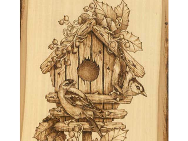
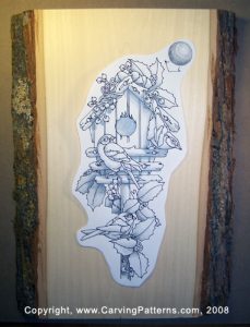
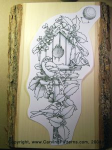
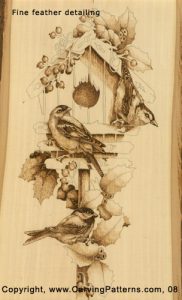
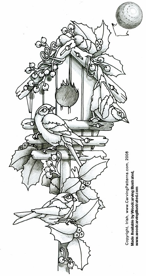
So I chose a winter bird house scene with a nuthatch, gold finch, chicadee and acorn, berry and holly trim.
That way it will be a fun decoration all winter long.
My goals in this tutorial are three fold.
1. I want to work with a simple line pattern and show how easy it is to determine where your shadows and shading go.
2. I want to do the burning on birch or mahogany plywood so that it will be easy to frame when finished.
3. I want to add coloring, either watercolors or colored pencil once the burning is completed.
These images are sized to print on a legal sized (8 1/2″ x 14″) sheet of printer paper. You can also resize them with a graphics of photo program to print on regular 8 1/2″ x 11″ paper.
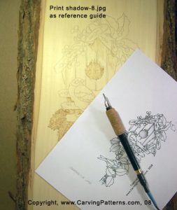
Save copies of each of these patterns on your hard drive. I usually recommend your Desktop so that they will be easy to find as we work through each step.
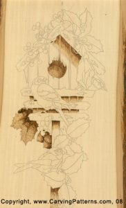
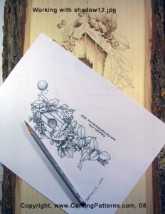
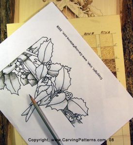
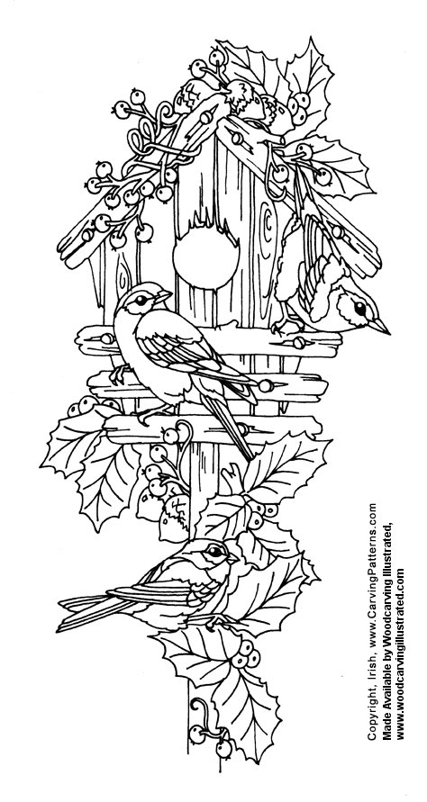
There are three images – the line pattern, a simplified line pattern and the drawing. You will need all three.
Once you have the patterns saved print a copy of the simplified line pattern so that you can work the shadowing steps with me.
I am not chosing any of my plywood pieces. I have a wonderful piece of barkwood basswood that I have been saving for something special and I believe this project is the one! It’s 16″ high with an 8″ wide working area of planed wood.
I think the bark will make a perfect instant frame. So when the burning is done and the coloring added it will be very simple to hang.
The clean white coloring of the basswood is what I want for this project as I want to work in a wide variety of tonal values and I want to add color. The basswood will accept those very low temp burnings well and add no natural coloring to the colored pencils or watercolors that we will be adding later.
This particular piece of basswood came from Heinecke Wood Products at Heinecke Wood Products They are great people with which to work!
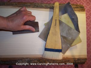
Step 1: Surface Preparation
I have sanded the top surface of my basswood board with several grits – 180, 220, 320 – to remove any saw marks and ridges. A pristine smooth surface means that my burner pen tips will not grab or skip over the small ridges or rough grain lines that you can find in any wood blank.
I have worked all three sandpaper grits with the grain of the wood. I do not want any cross grain scratches that can be caused by working perpendicular to the grain.
After the sanding was complete I dusted the wood surface very well and sent my old towel with the saw dust to the washing machine.
(As I proof this section I am reminded of how many times in my younger days I would work on inferior surfaces … rough drawing paper instead of rag content cotton watercolor or sketch paper, a canvas board instead of a good stretched linen canvas or a scrap piece of wood from the shop instead of a good wood blank. Then having worked my heart out and created something good I was so disappointed that I had done it on a junk surface.
I also remember how often I promised myself that I would “do it over” on a quality surface but never did. This does not mean that everything that you do needs to be done on an expensive premanufactured surface. It does mean that you should work on the best that you can and take time to really prepare that board well.
You NEVER KNOW when the next work will be your Master Piece!)
Step 2: The pattern, posted in the Free Carving Patterns sections here at Wood Carving Illustrated, is sized to print on a legal sized paper, 8 1/2″ x 14″. My board measures 16″ high, so my pattern is just a touch small for my board.
I opened the pattern in a graphics program, I use Adobe Photoshop CS3. If you have a photo editing program you can probably resize your pattern with that. I resized the design to 16″ then sliced that design into two pieces along the midway point of the pattern. I now can print those two images to create the larger sized pattern.
If you have questions on how to resize your image please refer to the Help section of your graphics or photo editing program.
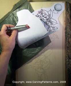
Step 3: I cut out the design then taped the two papers together. I have the design laid on the wood to find where I want to place the pattern.
Since this pattern has vertical lines in the slates of the bird house I grabbed my T-square ruler to insure that my pattern lines are perfectly vertical. Once I had the pattern positioned I used transparent tape along the top edge of the pattern to secure it to the wood.
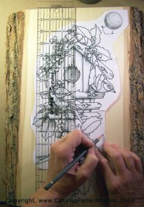
I often will add a few reference pencil marks on the pattern and wood. These are little straight lines that go from the pattern paper onto the wood. If my tape loosens or the pattern paper moves during the tracing process I can easily use those reference lines to readjust the design.
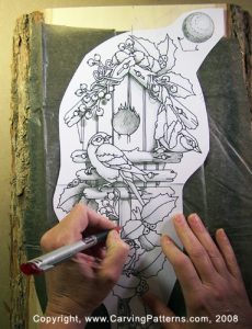
At this point I can either slide a piece of graphite tracing paper under the design and do my tracing with an ink pen. I prefer a red pen so that I see exactly where I have and have not traced.
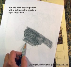
If you do not have graphite paper flip your pattern over so that the back is showing. Use a soft #2 pencil and rub the entire back with the pencil point until you have fully covered the paper with the pencil graphite. Now you can tape the design paper with the pencil rubbing to the wood and trace. The pressure from your ink pen will leave a pencil graphite drawing on your board.
I can check my progress by lifting the bottom edge of the pattern paper. I do not remove the tape until I am sure that I have traced every line.
Step 4: That pattern that I have traced is the simplified pattern. At this point in the work I do not need or want all the detail lines in the line art pattern. We will start the burning by working the general areas of the simplified pattern as if they were one unit not multiple grouped pieces.
Off to start the mapping for the darkest areas.
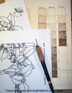
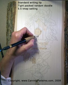
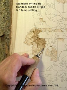
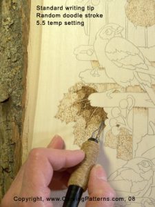
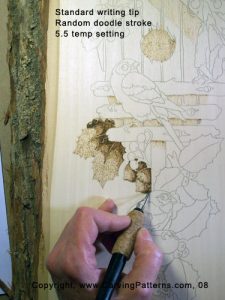
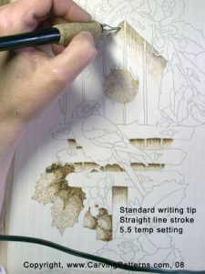
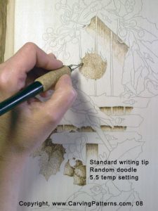
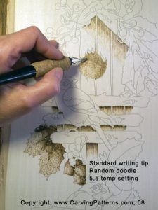
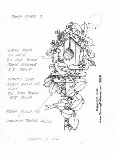
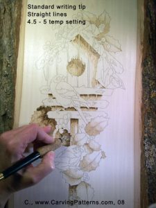
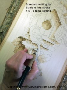
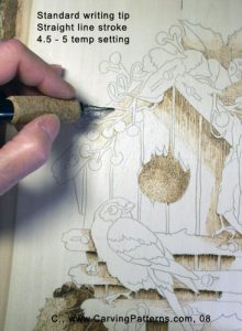
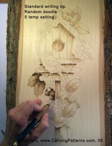
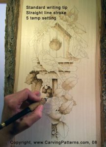
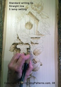
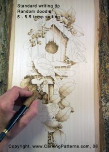
Step 5: Burn layer one
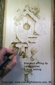
Standard writing tip, 5.5 temp setting
I printed a copy of my first shadow drawing image and I am going to use it as my guide for my first burn layer. This drawing shows me where the darkest areas of the design should fall.
Working with the standard writing tip in a comfortable writing position for my hand I have placed my temperature at a 5.5 setting. That is a cool or pale burn setting for my unit.
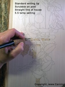
I want to keep the early burns in the pale tones during this early mapping step. As I work through the project I will slowly bring each individual area up to it’s final tonal value.
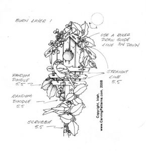
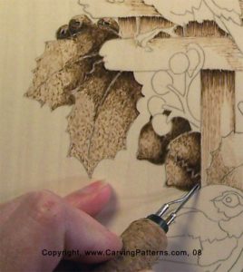
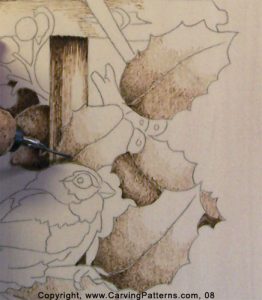
The holly leaves and berries behind the post are worked in a random curling doodle stroke. This will give the leaves a touch of texture. I am filling in the entire leaf and berry area as all of this grouping falls in the shadow area.
For the post that supports the bird house I used a tight scrubbie stroke working up and down to keep with what would be the wood grain direction of the post.
A simple straight line stroke fills in the two areas on the house that fall behind and under the perch struts.
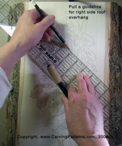
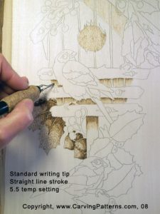
Before I begin shading under the right side roof strut I wanted to pull a pencil guideline. Since the roof strut has a fairly straight edge the shadow it would cast will also have a straight edge. I marked my line about 3/4s of the way down on the house from that roof strut. This is a very light pencil line.
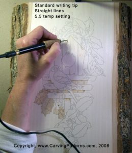
That roof strut shadow is now worked with a straight line. Because these lines are long they tend to burn a touch more cool than the short straight lines under the perches. That’s OK as this area is one of my largest shadows and the pale tone will create a nice gradually blend to the dark later.
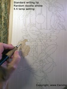
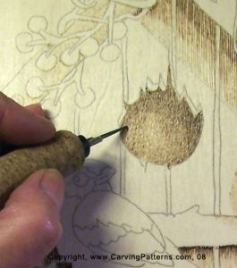
The hole into the house will eventually be black but for now I am using a tightly packed random doodle to fill it in.
I made a few quick notes on my printed drawing that I used for this step.
After I am finished this project I can keep these notes with the patterns for my files.
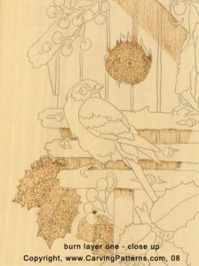
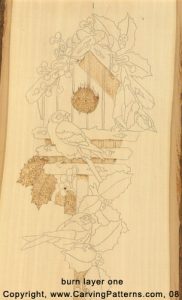
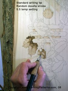
Here is the large and close up scans of where we are at in the project. I have even color tones and some nice texture starting.
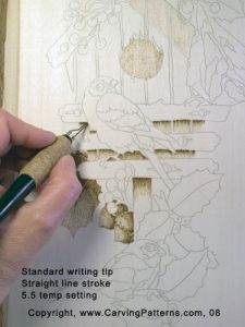
Step 6: Burn layer two
I have printed the folowing and will be using it as the guide for this layers burning.
I am not changing either my temp setting or my pen tip. This step will be worked at the same 5.5 temperature setting. As we work together you will see how adding layers of burning at the same temperature setting will darken the tonal value on an area.
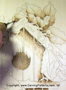
I have stared with the background holly leaves and berries and added a new layer of burning for my first shadow area. Since the leaves naturally curve any shadow that falls on them will also curve. I have worked this shadow in the upper right side half of the leaves.
Adding a third layer of burning darkens the area even more. This third shadow is worked on one half of the second shadow and on the upper right side.
My holly leaves now have a preliminary three tone graduated shadow. We will be working this area again at a later stage.
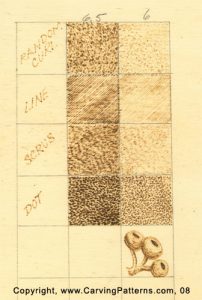
Laying my practice board with the tonal value grid squares onto my project I can see that I have three distinct tonal values and lots of room to add even darker shadows later.
Just as the holly leaves the acorns behind the post are curved – rounded – shapes. So as I am working the second shading into the upper right hand half of the acorns and caps. I want a curved edge to the bottom line.
The third layer of darkest shadow for the acorns again cuts the previous shadowing area in half.
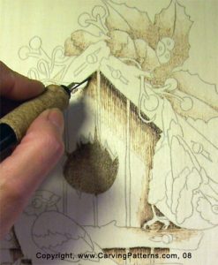
The shadow area under the post and perches is done with the straight line stroke pulled half way down from the perch element line. Since the side wall of the house is a flat surface this shadow has a straight edge effect at it’s bottom line. Compare that to the shadows on the post with their curved edge. The post is round so the shadow is round.
The third layer of shading under the perches and post gives a nice dark area. Notice under the goldfinches feet and rump that the entire trapped air area of the wall has a dark toned shadow.
I am pulling the straight line second shadow into the wall under the right hand roof strut. Again, I am working one half of the originally shadowed area. The third burning is bringing out the gradient look to this shadow area.
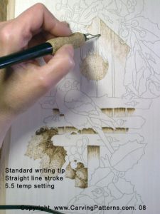
The inside of the hole is done exactly the same. Notice that the bottom edge of this shadow is almost circular to match the hole’s shape. The third layer keeps that same semi-circle shape at the bottom.
When I set the project across the table I felt like my first burning layer on the background holly leves was just not solid enough. So I have turned down my temp setting to 5 and added another layer of tight packed random doodles over the entire leave area.
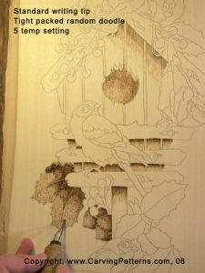
This fills in the open, unburned areas that were left in the first layer of work.
Here is the scan of this step and my written notes.
Step 7: Paper holly leaves
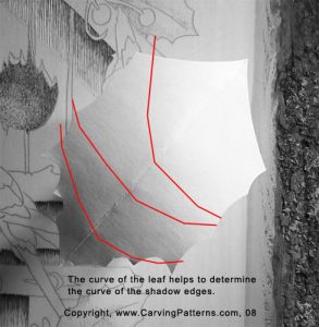
Leaves are not flat in either direction of their grain. They curve from the leave node where they attach to the stem to the leave tip. They also curve from the center vein to the outer edge.
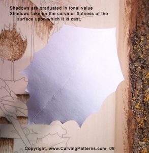
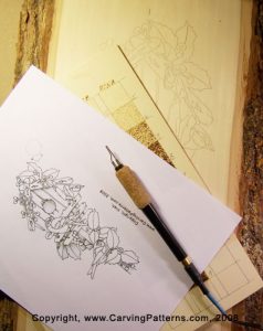
I have cut out a paper holly leaf, moved my light source to where our light source is in the design and then taken a photo. Since my holly leaf is made out of paper it has only one curve at this time – from stem end to tip.
You can see that the area closes to the light source is highlighted with white light and that the shading gradually deepens as you move toward the tip.
Gray scaling the photo shows the graduated shading more clearly. In this photo, since the light directly touches the surface the shape of the highlight or shadow are created by the shape of the light source. The lamp on the table has a round blub so it casts a rounded highlight or makes round edged shadows.
You have seen this in action when you see a rectangluar bit of sunshine on your floor that is coming in through the rectangular window.
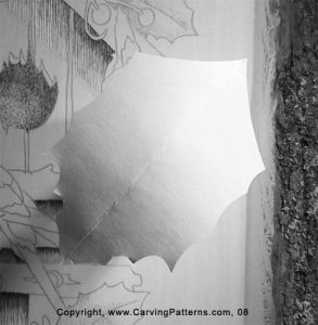
I cut this paper leaf then used my thumbnail to score a curved line through the center vein area. This lets me fold the leaf along that curve.
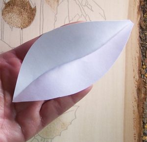
Notice that as the two leaf sides change directions in their curves the highlight and shadow areas change. Also notice that both sides carry their own highlights and shadows. They are not the same and they are not mirror images of each other.
In the gray scale photo I have mapped the curved edges of the shadows. Paper shapes are a great way to figure out where your shadows would naturally be according to your light source.
So – the shape of the light source in a direct hit can determine the shape of a shadow AND the curve of the surface the light hits can determine the shape of a shadow.
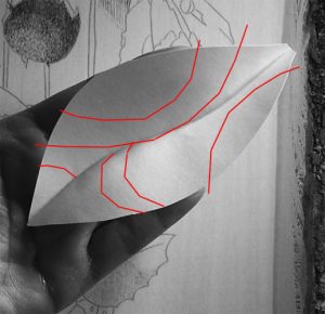
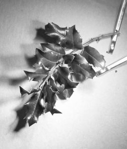
Now, luckily for our design I happen to have a mature American Holly tree. Holly leaves not only bend from stem to tip and from center vein to side edge they ripple with each leaf point. So we have lots of highlights and lots of shadows.
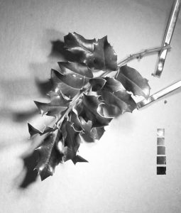
You can see in paper-holly-7.jpg the curved edge of the highlights and shadows. Plus I have given you a gray scale photo. In photo paper-holly-9.jpg I picked up some of the different gray tones from the photo and moved them over to make a gray scale. This photo has at least five different gray tones.

Two of my favorite leaves to use in a design are holly and oak. Both have this extra ripple within the leaf. Now, looking at the photo it may seem that extra ripple makes the leaf harder to burn … but it doesn’t. In fact, it is the eact opposite. Because of the extra ripples you as a new woodburner really can’t make a mistake in creating your shadows.
Any shading this is a little off or not quite in the right place are interrupted as just extra rippling!
The light source determines the shape of the highlights and shadows when it directly strikes the element. But it is the element that casts the shadow that determines the shape of the shadow.
In the following photo there are two paper leaves. Each leaf has one highlighted side and one shadow side created directly by the light source.
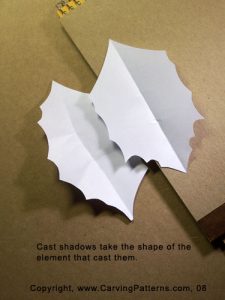
There are also cast shadows for this photo. The leaf to the upper right is casting a shadow onto the lower left leaf. That shadow edge has the exact shape of the upper right leaf edge. The lower leaf is casting a shadow onto the table. That cast shadow also takes on the shape of the lower leaf edge.
(I have two shadows because I had two light sources in this photo – my small spotlight and the overhead light. Turning off the overhead made the photo too dark to be useable – sorry!)
It is the light source not the position in the design or arrangement that determines which side of the leaves are highlighted and which are shadowed. My leaves in photo paper-holly-11.jpg are folded then set with that fold facing away from the light source. This makes the upper right sides of the leaves darker in tone than the lower left.
My foreground leaf therefore has it’s darkest shaded side in front of the upper right leaf. Plus the upper right leaf has it’s brightest highlighted side behind the foreground leaf.
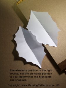
Most of the time we are tempted to always shade the background element, making it darker to push it away from the foreground element … but that is not always what we want to do. In this photo, if I were burning it and shaded the background leaf I would be changing the direction of the light source.
So … grab some printer paper, get some scissors and a table lamp. Cut a few simple shapes, fold them and then throw them on the table. Have some fun discovering how the shadows and highlights change as you rearrange them on your table.
When in doubt about any shadow burning use paper shapes.
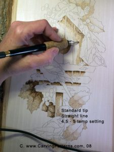
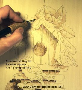
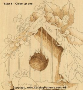
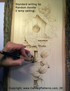
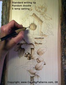
Step 8: Burn layer two – holly leaves
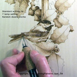
I have printed a copy of the layered burning and will use it as my reference guide through the next few steps. I am still working with my standard writing tip and since I am burning the holly leaves I will be using the random doodle stroke.
I have turned my temp setting down to between 4.5 and 5. These leaves lie in the middle range or foreground so I want them a touch lighter at this time.
A quick note about the random doodle stroke. For me, this is a comfortable, easy stroke. As I work I can move the tip lightly across the wood surface and my hand is in constant medium speed motion. This means that I get an extremely even color tone when I use this stroke.
I can control how light or dark an area is by how many curls I pack into that area. A few curls mean more unburned areas so a lighter or paler color. A tight pack of the curls gives me a medium tonal value.
I am working the first shadow burning into my holly leaves. I am using a low temp setting between 4.5 and 5 for my Colwood. You will need to adjust your setting according to the practice board tonal value grid that you burned for you unit.
Notice I have those curved edges to my shadow areas. I am treating each side of the leaf as an individual area or element.
Just above the chichadee’s head is a cluster of three leaves. The bottom right leaf is in front of the middle left leaf. But just as with our paper holly leaves the lower leaf, even though it is in front of the middle left, is the darker toned leaf.
Having done the first burning in these leaves I have started the second burning. I have not changed my temp setting – I am using a second burn to make the area darker. I want to keep that curved edge to the shadows and fill about one half of the area that was burned in the first working. This walks the shadow away from the light source and deepens it as it moves away from the same.
The scan image shows you where we are at in the work.
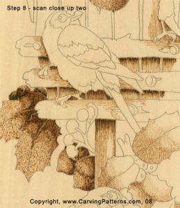
Still working from my reference guide I am adding the shading on the post using a straight line stroke that flows with the grain of the post’s wood. I have also added a few lines on the right side of the post. The highlight for the post would not fall directly on one side but instead closer to the center of the post.
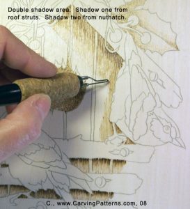
The shadow cast on the bird house wall from the nuthatch is also worked in a straight line stroke. The lines run up and down to flow with the bird house.
Notice the double shadow area where the bird’s shadow overlaps the roof strut shadow.
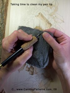
OK … That close up showed me that I needed to take a moment and clean my pen tip. I use very fine steel wool. You can also use rouge and a leather strop. Clean tips burn clean lines.
The shadow under the gold finch falls on both the house and the perches.
The house shadow is worked vertically with a straight line stroke but the line runs along the horizontal for the perch.
The straight line shadows under the berry vine on the roof have to run along the diagonal to match the roof strut.
My apologizes that this photo did not come out well. You can see this step in the scan close ups. I am shading the acorns on the roof with a random doodle stroke.
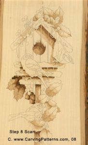
OK … here are the scans for this completed step. We have worked all of the shading that we created in shadow-9.jpg
Step 9: Enhancing the deep shadows
I have printed a copy for the reference guide to this step’s burning.
What I will be doing is darkening the deeper tones that we have already worked. The first two steps mapped out where I wanted my main shadows. In this step I want to develop those shadows so I have three strong tonal values – a pale tone, medium and dark – in each area.
I have my burner set just a bit above 5 and am using the standard writing tip. Throughout this step I am using the pen stroke that was used originally in each area. So if an area was burned first with a random doodle this step will also use the random doodle.
So … there will be lots of photos but not a lot of text for you to read.
I am starting with those far background acorns and holly leaves. This is still my darkest area of the burning. Since there is little change in the temp setting I am deepening the burn by slowly working over the layers that have already been done.
The post below the house needs darkening where the post touches the house floor. A dark stripe has been burned down the left side of the post but it does not quite touch the edge. As noted in an earlier post this is because round objects usually do not have the light source coming in from an edge but instead it hits the round object somewhere towards the middle point.
Also notice the small dark spot behind the chickadee’s feet where just a little bit of the post shows.
I have added shading to the left side areas of the holly leaves by the post. In the closeup you can see that several leaves now have four distinct tonal values burned.
The areas beneath the perchs should be very dark. I am using the same straight line stroke and pulling the pen tip slowly to let this area develop a nice choclate coloring.
In the closeup image you can see the perch shading under the finches tail.
Also notice how dark – almost black – the shadow right against the bottom edge of the perchs has become.
The entire hole in the center of the house needs to be dropped in tone.
The shadow cast from the roof strut is next. Plus the shadow cast by the nuthatch.
I have added quite a bit of extra shading in the acorns and leaves that rest on top of the roof. Most of this work is in the lower left sides of each element.
I am ready to add the berries for the berry vine and the holly berries. I decided to practice first on my practice board. This way I can decide how I want to burn these elements and see how they might look before I work on the actual project.
I am using the standard writing tip, temp setting 5 and a large circular stroke that matches the size of the berries. I am leaving an unburned highlight in the upper right side of each berry. Plus I have added a darker line along the upper right edge.
Step 10:
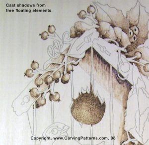
I caught much of what we did with our previous reference photo in the last step. So I will be using shadow12.jpg for this step.
This next reference photo deals with the shadows that were cast by elements that are above another element but not resting on that other element. Because there is some air space between the two elements the shadow does not touch the element that creates it.
I have worked a random doodle stroke with the temp setting just a touch above 5. I want those free floating cast shadows fairly dark.
Oh! … Side thought … As you are sitting at your computer and as I expect that you have some light source near or around your desk I want you to look at the shadow that is cast by your key board. Notice that the closer that shadow is to the light source the sharper and darker the edges of the shadow.
Shadows are not fuzzy, hazy, misty things. They can be extremely crisp edged and sharply toned. Objects very close to a light source cast very distinct shadows with strong edges. As an object moves farther away from the light source the edges become softer and less defined. They also become a medium tone instead of a dark tone.
Since our berry vines are assumed to be close to the light source they have crisp distinct edges and are in the darker tones.
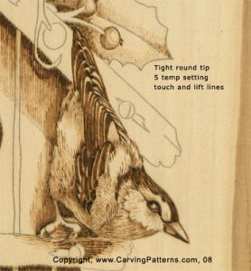
Step 11: Chickadee practice board work
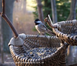
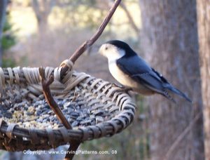
I am ready to start work on the birds in this design. I have printed a copy of shadow15.jpg as my reference. I have a couple of bird feeder photos that I took last year that, although they would never be considered good photography, show the shaping of the feather structures. As you glance at these note that you do not see each and every individual little feather! You see grouping and some of those grouping are extremely smooth.
If you remember when we did the drawing step on the birds we treated the feather groupings as if they were one unit.
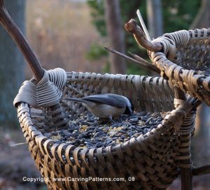
That is exactly how I am about to burn those birds. First I will do the general shading of those grouped units. Then I will return to each area and start adding the individual feather texturing.
You can do a google.com image search for black-capped chickadee, nuthatch and finch for better photos as reference guides. Please, there is an excellent thread in the stickie area at the top of this pyro section that discuses copyright and how it applies to us.
Question about Copyright Infringements
As artists we do have the right to refer to photos taken by artists other than ourselves. As in this case where you already have the chickadee pattern and just need to refer to a photo for shaping and coloring. You do not have the right to use someone’s photo for a wood burning – save to your computer, print with your printer, then trace to your board – without their consent and permission.
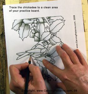
I have an extra copy of my pattern so I have decided to do a chickadee on my practice board first before I burn one to my project.
With a soft #2 pencil I have rubbed the back of my practice board to create a solid area of graphite. I then flip the pattern to face up, positioned it on a clean area of my practice baord and traced the pattern lines.
I want to jump ahead in my photos … we will get back to the chickadee in the next post. But here I want to talk about tip pen line widths.
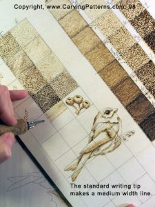
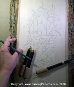
When I did the practice board I used the standard writing tip. In our supply list I noted that I would also be using the tight round and the micro writing tip. So I want to add those to my practice board.
The standard writing tip makes a medium width line. I am working at a 5 temp setting. That is my basic tip for early shading and texturing as it fills an area quickly.
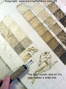
The tight round when you use the broad side of the tip makes a wide line. This pen tip is wonderful for graduated shadows where you do not want a texture or line stroke. I will use the tight round on it’s board side to create the shading in the birds.
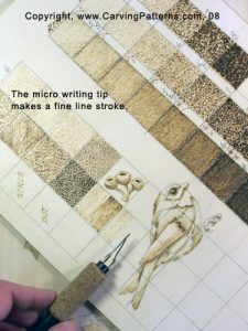
The micro tip makes a nice fine line and is great for detailing especially curved lines.
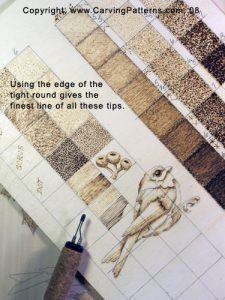
For me, using the tight round tip on it’s sharp edge creates the finest of lines. This line is often dark and burns quickly. So all I have to do is touch the edge and lift to make a strong fine little line. This is the tip I will use to add the feather details. I have even burned a small practice of the fine feather detailing onto my board.
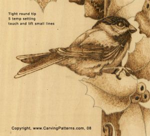
My first shading is done at a 4.5 to 5 temp setting. I am pulling long slow lines along the bottom, bottom right or far right side of each area just as I did in the shadow15.jpg drawing.
As I pull my lines I am overlapping each stroke just a little to avoid unburned fine lines between the strokes. Also I am making the lines conform to the shape of the area. A straight area as the tail or wings I am pulling straight lines. But along the belly area and shoulders those lines are picking up the curve of the tracing lines.
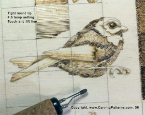
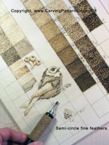
I have turned the tight round tip on it’s edge to add the dark areas of these shadows. I want a little feathering now so I have used a simple touch and lift stroke. When the dark was complete I turned down my temp setting to 4.5 and filled in the remaining fine feathers with a medium tone and a touch and lift stroke.
Big OOOPS! … When I was burning the dark head and neck bib for the chickadee I made a major mistake. There should have been a white line separating these two areas of the head coloring. Instead I burned them together.
So I grabbed one of my round carving gouges and gently carved away a thin stripe of wood. This returned me to unburned surface and restored that white strip.
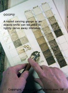
And that is another good reason the work first on a practice board.
Now that I have that corrected I finished the dark detail burning on the head and bib area, the wings and the tail. I also decided to add a few dark strokes along some of the deepest tone edges.
Well, I think I am ready to go on to my project.
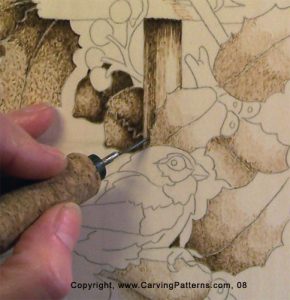
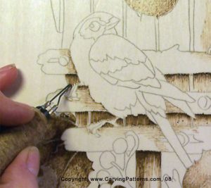
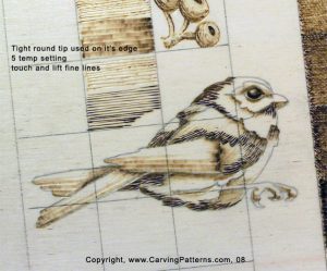
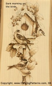
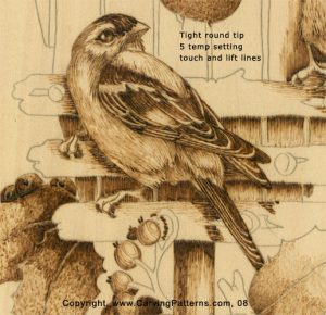
Step 12: Working the birds
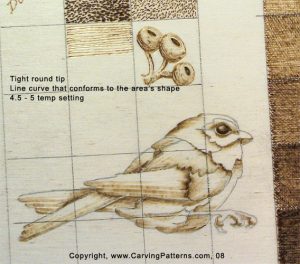
I have set my temp setting to 5 and am using the tight round tip to shade in the general body shapes of all three birds. A short line seemed to work the best for me. I am working the birds on the project board just as I did the Chickadee on the practice board.
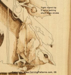
All three of these birds have some dark markings on their head, wings or tail. I changed back to my standard writing tip and have set up the temp to 7. I want a dark burn but I do not want my tip so hot that it halos. Nor do I want those marking absolutely black yet … I can always darken them more later.
Refer to the images for the dark marking placement.
The very fine feather detailing is burned using the edge of the tight round tip. I only need a temp setting of around 5 to get a nice blacklish line. This is a simple touch and lift stroke.
Again, the images will give you an idea of where you can add the detailing.
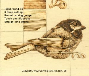
Step 13: Leaf veins
The holly leaf veins are little comma strokes that are worked from either the points along the edge of the leaves towards the center vein or from the center vein out. A little extra shading can be added along the tip points on the low side to make the tip curl slightly.
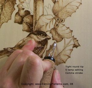
I am using the tight round tip on its board.
Attachments:
Birdhouse Pattern Drawing
Birdhouse Patten
Birdhouse Simple Pattern
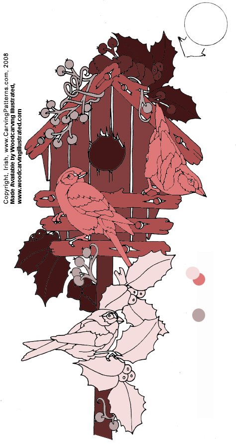
Birdhouse Pattern Colorized
